Join Over 60,000 People & Get FREE Weekly Tips in Your Inbox!

SUBSCRIBE

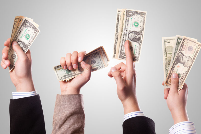
1 Simple Sales Page Tip to Instantly Add 25% More Sales

You probably know by now that here at Live Your Message we’re obsessed with conversion…

We’re obsessed with the question: How do we inspire more action and more sales with the same amount of traffic? How do we get off the traffic and marketing treadmill and better serve the people who are already coming to us?

Because that’s how we as business owners go beyond what I call a “one-second-stand” – the ultra-brief love affair most people have with their visitors before they bounce – so we can deepen our relationship with you.

You’re our reason for being.

If you don’t say yes to subscribing to our newsletter and investing in our programs, then we can’t be of service. We can’t contribute to you and we definitely can’t transform your life with what we do…

I imagine you’re reading this because you want to move more people into action and inspire more people to say yes to working with you.

That’s why I wanted to share this one super-simple sales page tip for instantly adding up to 25% more sales to any webinar or launch you do.

Change the Game and Change the World with Your Authentic Brand (Video)

What’s your most precious and valuable resource? Think about that for a moment. It’s not money, right? And it’s definitely not stuff… If you’re anything like me it’s time.

Your time & attention is the only thing that once you’ve spent it, you can’t get it back.

So it’s no coincidence that Email. Facebook. Smartphones. Ads. Apps. Games. Media… are all designed to grab attention and keep you hooked and engaged for as long as possible. Time & attention really are the new currency of our internet age.

If you’re in a business that relies on the internet for new customers in some way shape or form than this may be the most valuable video you watch all year.

The Top 2 Approaches to Taking a Signature Photo for Your Website

If you are the face and voice of your brand or the key reason why people choose to work with your company, then people need to see you and know what you look like.

You can’t hide behind your work, or bury your photo on the About page of your website.

You have to truly step forward and allow yourself to be seen.

The best signature photos tell a visual story of who you are. They allow your visitors to almost feel like they know, like and trust you in a single glance, paving the way for a deeper level of connection and relationship. And they align with your message, your brand and how you want to show up. There are two primary approaches you can take with your signature photos…

From Reader to Raving Fan: How to Write a Bio or Social Media Profile that Inspires Your Audience to Work with You.

If someone wants to check you out, they’re going to Google your name. Or they might head on over to the About page on your website, or read your profile on LinkedIn or what you say about yourself on Facebook. The problem is that most people don’t put a lot of care into what they … Read more

How to Find Your Unmistakable Voice in a Marketplace Full of Copycats (What Jackson Pollock Taught Me About Marketing)

I got up close and squinted. I could make out the figure of a man, pushing his tired horses through a mountain pass on a moonlit night under starry skies. If anything, it looked like it could have been a Van Gogh. Anyone but Jackson Pollock. And then Murray piped up: “Wow! Even someone as unmistakable as Jackson Pollock didn’t start out Jackson Pollock!”

That thought struck me, so that night I dug deeper into Jackson Pollock’s life…

And what I learned has completely shifted the way we market our business.

Jackson Pollock painted “Going West” in 1934. It was a solid work of art that’s still exhibited today, but it could have been painted by any talented artist of his generation… There was nothing about it that screamed Jackson Pollock…

And then, lightning struck.

How to PRE-Qualify Your Prospects: The Secret to Crafting Free Consultation Pages that Attract Your Ideal Clients

If you sell any kind of 1:1 or high-end group offerings such as coaching, consulting, speaking or done-for-you services, the first step to enrolling new customers is usually getting a prospect on the phone to see if it’s a fit.

One of the fastest ways to fill your coaching, consulting, speaking or service business is to do more free initial consultations with qualified prospects.

I can’t tell you how many times I’ve talked to students who were having a hard-time filling their practice. Then, when I asked them how many initial consultations they were doing, they said none. Zip. Zero. So it was pretty obvious why they didn’t have the client-base they wanted.

And, when I reviewed their website, 9 times out of 10, they didn’t have a good process in place to turn visitors into prospects by getting them signed up for a free discovery call.

Not a lot of Wordpress or Squarespace templates come with this functionality baked into it, so most people just add a “schedule a call” link or button on their coaching or services page and that really doesn’t work well enough, especially when you’re first getting started and you don’t already have people coming to you site ready to work with you. That’s why we’ve included 2 free consultation page templates optimized to get the right people on the phone with you in our Take Flight Now web packages.

Here’s the simple 2-step process we use for optimizing your website to grow your client-base:

The *Only* 4 Fonts that Your Site NEEDS to Be Taken Seriously…

I LOVE talking about fonts because very few people realize the full power of typography to transform the look, feel and experience of your business…

Some of you may know the famous story Steve Jobs tells of studying calligraphy at Reed College, which at the time had the best calligraphy department in the country:

“Throughout the campus every poster, every label on every drawer, was beautifully hand calligraphed…I learned about serif and sans serif typefaces, about varying the amount of space between different letter combinations, about what makes great typography great. It was beautiful, historical, artistically subtle in a way that science can’t capture.”

“When we were designing the first Macintosh computer, it all came back to me. And we designed it all into the Mac. It was the first computer with beautiful typography. If I had never dropped in on that single course in college, the Mac would have never had multiple typefaces or proportionally spaced fonts. And since Windows just copied the Mac, it’s likely that no personal computer would have them.”

You see before the Mac computers just used a single typeface. Fonts were functional. They weren’t seen as something that could add to the user experience.

And for most people, fonts still are primarily a functional way to display written content. And most people can only name a handful of fonts: Times New Roman, Arial, Helvetica and perhaps a few more.

Now I wish I had time to do a full training on typography here, but we have a lot to cover so I’m going to focus on what I call your font palette.

Your font palette are the 3-4 branded fonts that you use consistently across every web page you create, as well as all your other materials.

So the right font palette not only adds to your company’s brand, but it can actually increase your conversions by calling attention to exactly what you want your visitors to focus on.

Let me walk you through the 3-4 fonts that make up your font palette (I recommend watching the video training above to see examples of each of these font types):