I LOVE talking about fonts because very few people realize the full power of typography to transform the look, feel and experience of your business…
Some of you may know the famous story Steve Jobs tells of studying calligraphy at Reed College, which at the time had the best calligraphy department in the country:
“Throughout the campus every poster, every label on every drawer, was beautifully hand calligraphed…I learned about serif and sans serif typefaces, about varying the amount of space between different letter combinations, about what makes great typography great. It was beautiful, historical, artistically subtle in a way that science can’t capture.”
“When we were designing the first Macintosh computer, it all came back to me. And we designed it all into the Mac. It was the first computer with beautiful typography. If I had never dropped in on that single course in college, the Mac would have never had multiple typefaces or proportionally spaced fonts. And since Windows just copied the Mac, it’s likely that no personal computer would have them.”
You see before the Mac computers just used a single typeface. Fonts were functional. They weren’t seen as something that could add to the user experience.
And for most people, fonts still are primarily a functional way to display written content. And most people can only name a handful of fonts: Times New Roman, Arial, Helvetica and perhaps a few more.
Now I wish I had time to do a full training on typography here, but we have a lot to cover so I’m going to focus on what I call your font palette.
Your font palette are the 3-4 branded fonts that you use consistently across every web page you create, as well as all your other materials.
So the right font palette not only adds to your company’s brand, but it can actually increase your conversions by calling attention to exactly what you want your visitors to focus on.
FYI, I show you a really ninja way to do this in the training video above (as well as many more visual examples that aren’t in the written version of this post, so I really recommend you watch the video).
Let me walk you through the 3-4 fonts that make up your font palette (I recommend watching the video training above to see examples of each of these font types):
- First of all you have your logo font. Or the font you use to depict your company name or, if you have a personal brand, your name.
- Next we have header and title fonts, that may or may not be the same as your logo font. If you use a fancy, script or serif logo font, I would recommend using something simpler and cleaner for your header and title fonts.Since your headers and titles are the most important copy on your web pages, you want these to be as clear and eye-catching as possible. The right headline can double or triple conversions, especially if it’s emphasized by a font font that calls attention to it.
- Next up we have your body copy. Or the font you use for the rest of your copy throughout your website. You want this to be as clear and legible as possible. And you want to stay completely away from script and serif fonts here.You really this font to go under the radar. People aren’t supposed to notice the font choice of your body copy, you want them to read that copy, right? But I do recommend keeping it 100% consistent across everything you do.
- Finally, our last font. This is something very few people know about or implement. This is what we call your “accent font”. This font can be a bit more playful, distinct or branded to your business.Since accent fonts are used to create visual emphasis, it’s common to choose a hand-written or script font here. This allows you to use your accent font as a visual prompt to call attention to buttons, important text, or to divide sections of your website.
Now here’s where it gets really ninja…
You’ve probably heard that once you’ve established your visual brand identity, it’s really important to repeat the same visual branding elements over and over so people start to recognize your materials pretty much instantly at a glance.
We’ve done this really well across our businesses, so you can quickly recognize Superhero Summits materials or Live Your Message materials.
Once you’ve chosen your font palette, it’s time to rinse and repeat.
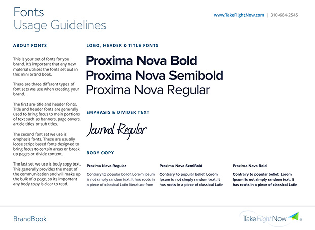
Here’s a page from the Brand Book we give each of our Agency customers. You see, it defines each of the fonts in your palette, so you can share these specifications with anyone who joins your team or creates materials for you.
A Brand Book or Style Guide makes it easy for you to maintain consistency across your platform and materials so you get that instant brand recognition that separates you from 99% of your competitors and instantly makes you look like the real deal.
I don’t have time in this article now to go through the rest of this Brand Book, but when you’re ready to get serious about your brand, I also recommend choosing a branded color palette, creating a custom logo, and defining the style of imagery you want to use. All that will go into your Brand Book too.
Tell me, what’s your favorite font?
Love it? Hate it? Let me know...
-
Thank you for an elegant and useful reminder. One takes things at face value: some sites do look sleek and professional, whilst others struggle to be taken seriously – now you have analysed the reasons and provided the solutions. Thank you again – please accept my kindest regards.
-
That’s just it, Zarayna. People tune into the signals we send almost instantly, but very few people are fully aware of the impressions they’re making — good or bad…
-
-
Thanks for the tips. I am going to review my website and make sure to follow these suggestions.
-
Great. It’s one thing to learn. Another thing to implement it. So glad to hear you’re putting this into practice.
-
-
Interesting… Thanks for such an informative post!
However, the body fonts shown on that sample page are flea-sized, especially when compared to the elephant-sized title and header fonts. Makes a page very unpleasant to read – if you bump it up to where you can comfortably read the body, the headers become hard to read because they’re way too big. Plus, “Journal Regular” is not an easy-to-read manuscript font.
Your size choices on this page are much better than what’s shown on that sample page.
I know nothing about fonts, though. My comments are just my user experience. I groan out loud every time I see a page with flea-sized body font, and I only stay on the page if the information on it is something I really, really want to read. If it’s not, then I bail out really fast.
Oh, two more things…
(1) Your message in that band at the bottom of the page is almost perfect for my taste in header vs. body font size. The only complaint I have is that it takes up too much space and can’t be turned off.
(2) I’d love to get your special report, but I’m not about to (a) “Like” any FB page sight unseen nor (especially) (b) use FB for anything other than communicating with friends and family (I sign in during the evening for an hour or less, take care of updates, and avoid it like the time-wasting plague it is the rest of the time).
-
Hi Terry,
Thanks for your thoughts.
A Brand Book is an internal document to guide font selection in the future. It’s not meant as an external marketing piece, so proportions of fonts are not the same as what we would do on a website. Also, that image needs to be less than 620 pixels to fit into my blog — it’s not meant to be read, it’s just an illustration.
Also, Journal Regular is not meant to be a manuscript font. It’s an accent font which is usually only used on a few words at a time.
Re: our pop-up on the bottom. This is a business website and that has helped us build a 30K person list in 2 years, so I’m keeping it… 🙂
Re: the special report. That’s reserved for our Facebook fans. I totally understand your stance on Facebook. You need to use that in a way that suits you.
Take care,
Marisa
-
-
Thanks Marisa! This was definately enlightening! Thanks for being our superhero.
-
Channeling my inner superhero for shiz… 🙂
-
-
Hey, Marisa,
Thanks for answering my post and for clarifying some points.
Even though the font guidelines graphic is just an illustration, I still think the size difference between headers and body font is out of kilter… (I’m assuming they’re shown to scale.)
Re your bottom-of-page ribbon — I know why you use it. I simply don’t like that it takes up about 20% of my vertical space and that I can’t close it to declutter my screen.
Thanks again for responding, and for the interesting post.
-
Thanks for this needed information Marisa. Now will you please do a post on why Comic Sans should NEVER be used?!! I’m going to pull my hair out if I see one more professional (and I don’t mean professional cartoonist) use that font!
-
Welcome to my world!
-
-
Oh My Gosh! I feel like I just hit the JACKPOT! I’ve been searching the web to find this information FOREVER & finally, I have found it! I loooove how you had it all presented in such a nice, condensed, & straight-to-the-point video! Bless you! This has helped me so so much.
-
So glad you enjoyed this Katie! Thanks for sharing 🙂
-


Leave a Comment