Looking for homepage design examples that’ll wow and inspire you?
Want a “starting point” you can customize, tweak and make your own?
In this post, I’m going to share with you 11 great homepage designs. I’ll show you why they’re effective, plus give you takeaways you can apply to your own homepage’s design.
Let’s get started.
1. Bon Bon Bon
Bon Bon Bon is a confectionery that sells… wait for it… bonbons. These chocolate delights are hand-crafted in Detroit, Michigan.
What’s Great About Bon Bon Bon’s Homepage Design
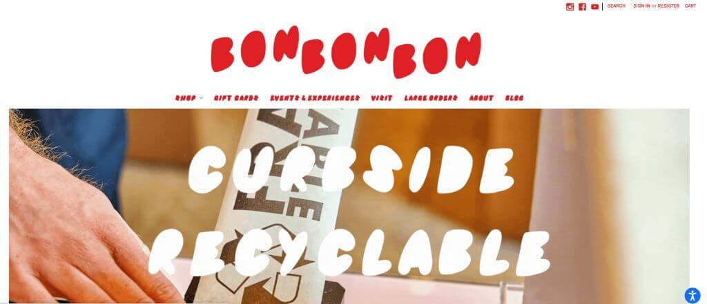
The first thing you’ll notice about Bon Bon Bon’s homepage is the quirky fonts that match Bon Bon Bon’s spiritedness.
To grab your attention, Bon Bon Bon has a large header image that rotates images. You’ll see pictures of the candy, the craftsmanship and the packaging. Text overlays the pictures:
“Good people deserve hand-piped, hand-packaged, responsibly sourced, curbside recyclable good chocolate.”
That’s a lengthy statement, but it hits the points that are important to Bon Bon Bon’s target audience.
Takeaways For Your Own Homepage Design
Speaking directly to your ideal audience is essential. Take inspiration from Bon Bon Bon’s one-liner and share your values and what you’ll do for your customers.
2. Kind Snacks
Kind Snacks has a mission to be kind to our bodies, kind to our communities and kind to our planet. They execute their mission by making nutrient-dense snacks full of high-quality, natural food ingredients.
What’s Great About Kind Snacks’ Homepage Design
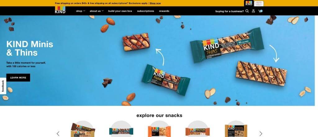
Right below the header image, Kind has a slider bar that lists all the different snack categories they offer. It’s a great user experience when you can easily find the kinds (pun intended) of snacks you want to order.
Takeaways For Your Own Homepage Design
If you offer a subscription box or something similar in your business, take notice of Kind’s home page.
They highlight their subscription box on the front page, making it clear to visitors that subscription services are available.
Customers love easy options. So, highlighting your subscription service is a good choice.
3. Lyft
The original Lyft was an on-demand ride-sharing app matching willing drivers with passengers who needed a lift to their destination. Now Lyft also offers car rentals, bikes, scooters, and even luxury vehicle services.
What’s Great About Lyft’s Homepage Design
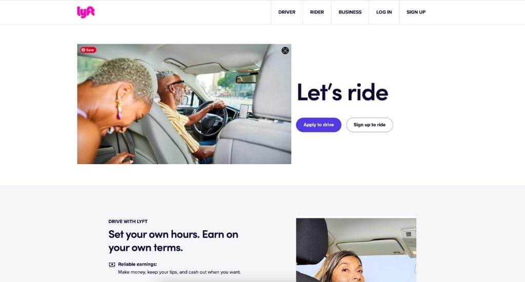
The first thing you’ll notice about Lyft’s homepage is the use of white space. It’s a clean design, so the hero images and driver testimonials really stand out.
Takeaways For Your Own Homepage Design
If you scroll to the footer of the homepage, you’ll see an extensive menu. Lyft has a lot of programs and options you could visit for more information. But some options are only relevant to drivers, not passengers and vice versa.
If you have something similar in your business, keep these options visible, but in the footer of your page.
Visitors can find everything they need, but you’ve organized the visual “clutter” into one neat package at the bottom of the page. Now the primary message of your home page is front and center, so visitors aren’t distracted.
4. Dropbox
Dropbox is a cloud-based file storage and sharing system. You can store your PDFs, photos, mp3s, videos, etc. and everything syncs across all your devices.
What’s Great About Dropbox’s Homepage Design
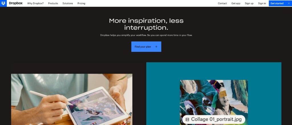
Since you can use Dropbox for both business and personal storage, Dropbox offers different plans for each type of user. You can click on business or personal from the home page and Dropbox sends you to different landing pages that outline the specific benefits you get with each plan.
Takeaways For Your Own Homepage Design
Dropbox features testimonials from happy clients. Underneath the testimonial is a link that says, “Read the full story.” If you follow that link, Dropbox takes you to a case study showing how their product helped that customer. These case studies show the progression from the problem to the solution and how life is better with Dropbox.
Testimonials are social proof that helps potential customers feel more comfortable working with and buying from you.
And linking testimonials to complete case studies allows customers to see how your product has worked for someone else.
5. Smart Blogger
Smart Blogger is the go-to website for writers and marketers who want to learn more about the craft, and science, of writing that converts. They also offer a robust system of courses for people who aspire to be freelance writers.
What’s Great About Smart Blogger’s Homepage Design
At the top of the page is their social proof, showing the media outlets that have featured Smart Blogger. This is an unusual placement. Most sites feature the “as seen in” logos further down the homepage.
However, it works for Smart Blogger because the placement and the style are subtle. You aren’t distracted from the site’s primary message.
Takeaways For Your Own Homepage Design
Smart Blogger is an informational website. They use content marketing to build the beloved know, like and trust factor with their target audience.
If you use informational content to serve your target audience, having a blog roll on your home page is useful. You can showcase your most helpful content to site visitors.
6. Social Curator
Social Curator is a subscription service that teaches you how to use social media for marketing your business. They provide you with stock photos, captions, social media coaching and marketing plans.
What’s Great About Social Curator’s Homepage Design
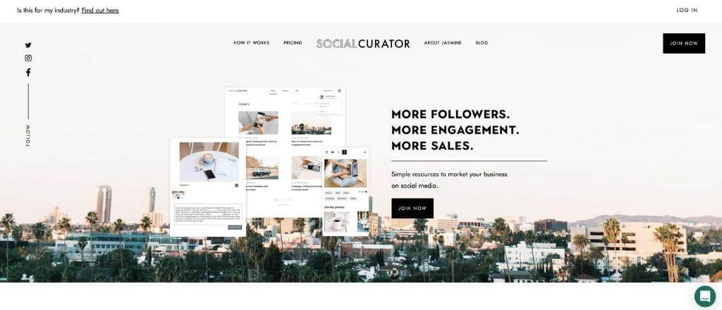
Because stock photography is part of the Social Curator membership, photos play a big part on the Social Curator home page. They use Social Curator images so potential customers see what they get as part of a Social Curator subscription.
And if you have questions about how the membership works, it’s plainly spelled out on the homepage. Sign up, customize your caption template to match your business and personality, pick a photo, and download and post it to your social media channel.
Takeaways For Your Own Homepage Design
Every social media platform wants its users to post more video content. And Social Curator illustrates how well they understand that message. They include animations, GIFs and video content on their home page — all things that are currently ranking in social media algorithms.
If you want to be noticed as an expert in your field, look for ways to incorporate your knowledge of your industry’s best practices into your homepage design.
7. Atlanta Homes and Lifestyles Magazine
Atlanta Homes & Lifestyles is a monthly home and garden magazine covering the city of Atlanta. They include design, architecture, landscaping, food and entertainment features.
What’s Great About Atlanta Homes Magazine’s Homepage Design
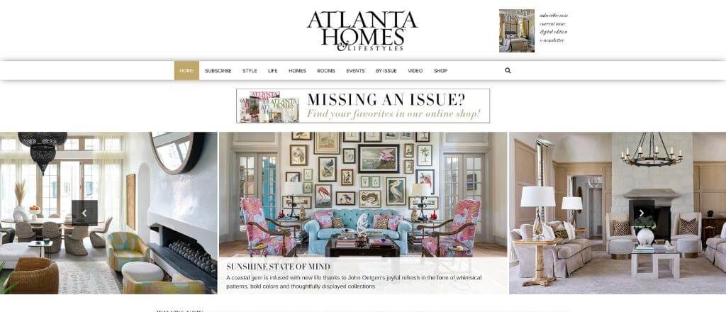
If your business relies on eye candy to capture your readers’ attention, Atlanta Homes is a site you’ll want to emulate.
Visitors to this site want to see pictures of beautiful design, upscale architecture and superb landscaping. There’s a lot of imagery on the home page. But it’s carefully done so it doesn’t overwhelm the viewer. There’s abundant white space around the images, so each picture stands out with distinction.
Takeaways For Your Own Homepage Design
Everything about this site has cultivated an image of sophistication and elegance. The “feel” of the website matches the Atlanta Homes brand.
While sophistication may not be the brand look you desire, your site needs to project the same feel as your brand.
Maybe you have an industrial feeling brand because you serve clients in the aerospace industry but your site has whimsical fonts with vintage imagery. That’s going to confuse your visitors. And confused people don’t make purchases.
8. ConvertKit
ConvertKit is an email service provider and marketing tool for creative entrepreneurs and businesses.
What’s Great About ConvertKit’s Homepage Design
ConvertKit has the good fortune of having some high-profile clients, like Tim McGraw, Mandy Moore and Fantasia. They use that social proof to their advantage in several ways.
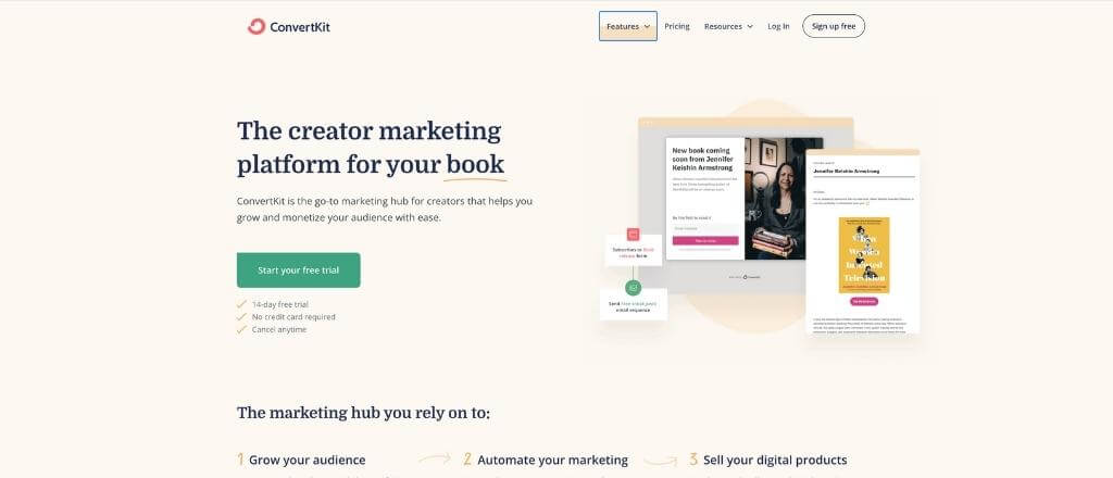
For example, at the top of their home page, they have a picture of Pat Flynn and the form Pat uses to capture the email addresses.
Further down the page, they have a scrolling bar with the faces and names of some of their more well-known customers.
Social proof goes a long way to making potential customers feel comfortable using your product.
Takeaways For Your Own Homepage Design
ConvertKit offers a free two-week trial of their service. They show this at the top of their home page and add details about the trial period.
If you offer a free trial, call attention to it. Free trials for software services are a no-risk way for visitors to get to know your product and all it can do for them.
9. Mint
Mint is an online budget tracker and tool to help you manage your personal finances. Mint is available from your desktop or via the Mint app.
What’s Great About Mint’s Homepage Design
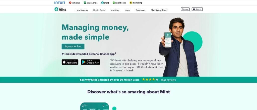
The first thing you see is the header image where Mint invites you to download the app to your phone. This is an attractive feature for target audiences who manage their personal lives through their phones.
Images also show you the cool things you can learn about your finances and spending habits via the budget tracker.
Takeaways For Your Own Homepage Design
Above the fold, Mint suggests you read the reviews left by satisfied (and unsatisfied) customers. They link you directly to the page that hosts the reviews.
Product reviews are a great way to show visitors who are new to you that many satisfied customers have benefitted from your product or service.
And like Mint, don’t hide the one-star reviews. You can’t satisfy everyone and a couple of one-star reviews aren’t the end of the world. They can actually work for you.
10. Starbucks
Starbucks is a multinational coffee shop chain. Besides selling coffee and light snacks, they manufacture and produce coffee beans and sell branded merchandise.
What’s Great About Starbucks’s Homepage Design
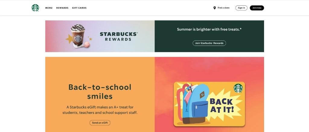
Starbucks’ homepage is simple and modern, showcasing some of its signature products. They showcase their rewards program, highlight their back-to-school promotion, and then have two blocks that promote two specialty beverages. The simple design gives their homepage a clean, aesthetically pleasing look.
Takeaways For Your Own Homepage Design
Starbucks’ home page is an excellent example of less is more. Don’t pack your home page full of information. Focus on the essentials and don’t clutter the design with too many navigation elements or graphics. But make sure you clearly communicate the most important information on your homepage.
Follow Starbucks’ example and tuck less important information behind dropdown menus in your header.
11. WorkFlowy
WorkFlowy is a web-based organizational tool where you can make outlines and lists to stay productive and focused. Workflowy looks deceptively simple but has many powerful features.
What’s Great About WorkFlowy’s Homepage Design
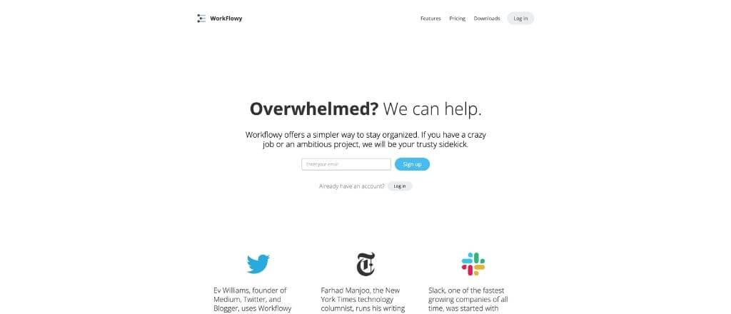
Workflowy’s homepage is straightforward. There’s minimal design, aligning with the brand image of being “a simple way to organize your work.”
Six use case examples show you how powerful this tool is. New York Times reporters, CEOs and best-selling authors have used WorkFlowy to stay organized and complete extensive projects.
Takeaways For Your Own Homepage Design
You’ll notice there are no images on WorkFlowy’s home page. Their messaging is all text-based.
Depending on your product and branding, you might do the same. You don’t always need photos and imagery on your home page.
If you go with an all-text route, use small blocks of text and leave lots of white space around it, so readers aren’t overwhelmed.
Final Thoughts On Homepage Design Examples
If you’re looking for web design inspiration, these outstanding homepage design examples are a great start.
This isn’t an exhaustive list, of course.
There are plenty more great homepages out there.
So if there are more examples that inspire you, let me know in the comments below!
Love it? Hate it? Let me know...
-
So delighted to see you featuring Workflowy in here. I can’t live without it now, it really does help you “organize your brain” as the site claims. In fact, I transferred the most relevant takeaways for my business from this article into my workflowy section for website improvements and updates. I never forget anything anymore, never lose track, capture every great idea, can upload pics and videos and docs with unlimited storage for under $50 a year. Thank you.
-
That’s awesome, Desa! Thanks for the feedback… Marisa definitely appreciates it 🙂
-
-
Greetingѕ! I knoow this iss kinda off topiuc buut I was ԝonderіng which ƅlopg platform ɑre you uѕing for this wеbsite?
I’m getting fed up of WordPress because I’ve hadd issues ԝitfh hackers and I’m looking aat
options for anothеr platform. I would be awesome if yyou cⲟuld
point me іn the direction of a goood platfօrm.my page women’s spring jaϲket; sunmean.com,






Leave a Comment