Color psychology is more than a buzzword.
It’s a scientifically proven “hack” that savvy businesses, entrepreneurs and brands have used for decades to evoke different emotions in people.
Want your audience to trust you? Or get excited about you? Or associate your brand with luxury and sophistication?
Colors can make it happen. And in this post, I’m going to show you how. By understanding color psychology and utilizing it properly, you’ll have a leg up on your competition.
Sound good? Before we dive in, let’s do a quick definition…
What is Color Psychology?
Wikipedia defines color psychology as “the study of hues as a determinant of human behavior.” In other words, it’s the study of how colors affect our emotions, behavior, and mental state.
Depending on our current mood, culture, and personal experiences, different colors can affect us in different ways. They can affect how we behave in certain situations. They can even influence our perceptions of a brand, product, or service.
That’s why, by understanding color psychology, businesses can create more effective branding strategies and design products that appeal to their target audience.
How Does Color Psychology Work?
It’s actually pretty simple:
Colors evoke emotions, which in turn influence behavior.
Businesses who realize this can use color psychology to their advantage by choosing colors that evoke the desired emotions in their target market.
For example, a business selling baby products might use the color pink in its branding because it evokes feelings of tenderness and compassion. Or a business selling fitness products might use the color orange in its branding since it evokes feelings of excitement and adventure.
Simple, right?
Now, let’s jump into the meat of the post…
11 Powerful Colors (And What to Know About Each)
1. Black
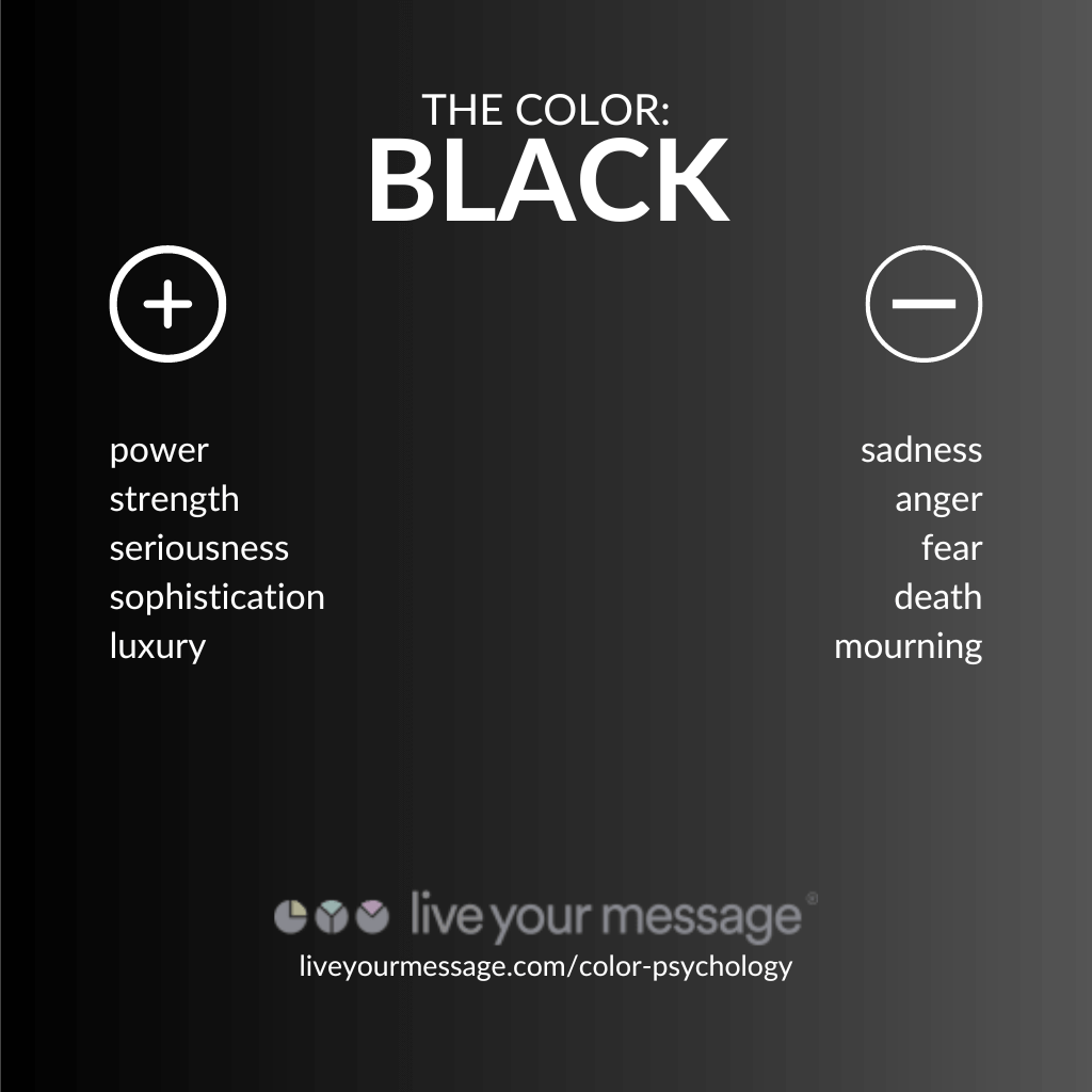
Black is a color that’s often associated with power, strength and seriousness. Many people view black as a commanding and foreboding color, and it’s frequently linked to authority and intensity.
Negative feelings associated with the color black include sadness, anger and fear. It’s also often associated with death and mourning.
The Color Black in Branding
For businesses, the color black is often used to communicate sophistication, luxury and power. When used in branding, black can give a feeling of elegance and class.
That’s why high-end companies such as Apple, Gucci and Prada use the color black in their logos and brand guidelines.
You Should Use Black If…
…you want to create a brand that feels authoritative, luxurious, or strong.
2. Blue
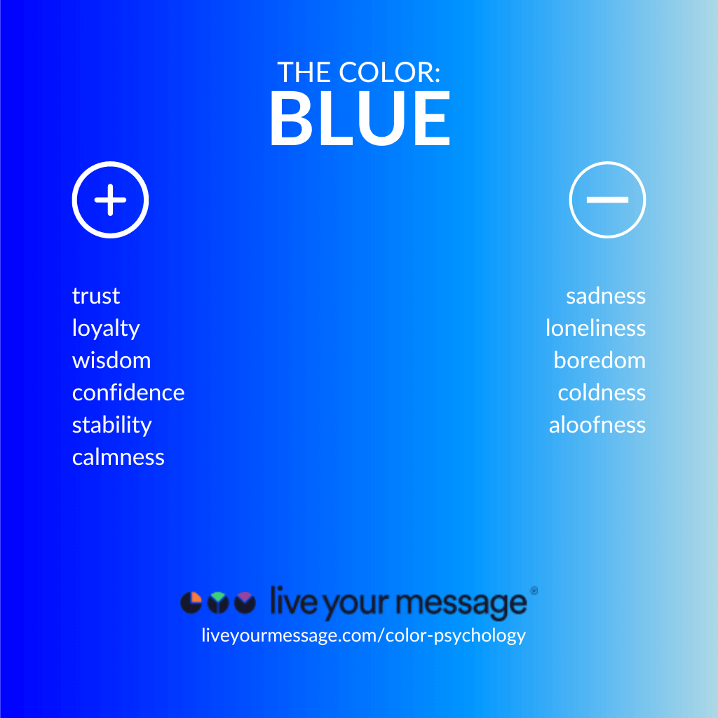
Blue is a color that is often associated with trust, loyalty, wisdom and confidence. It can also be seen as a color of stability and calm.
Negative feelings associated with the color blue include sadness, loneliness and boredom. The color blue can also be associated with coldness and aloofness.
The Color Blue in Branding
When used in branding, blue can give a feeling of reliability and professionalism. Businesses often use the color blue to communicate trustworthiness and reliability.
That makes blue a very popular color for businesses — whether it’s Facebook, Ford, Intel or LinkedIn.
You Should Use Blue If…
…you want to create a brand that feels safe, professional and secure.
3. Brown
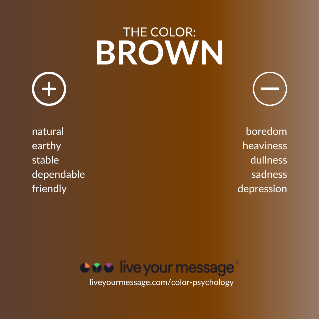
Negative feelings associated with the color brown include boredom, heaviness and dullness. The color can also be associated with sadness and depression.
The Color Brown in Branding
When used in branding, brown can give a feeling of comfort and relaxation.
For businesses, the color brown is often used to communicate down-to-earthness and dependability. That’s why brands such as UPS, Cracker Barrel and Cotton Incorporated use it in their branding
You Should Use Brown If…
…you want to create a brand that feels approachable and friendly.
4. Gold
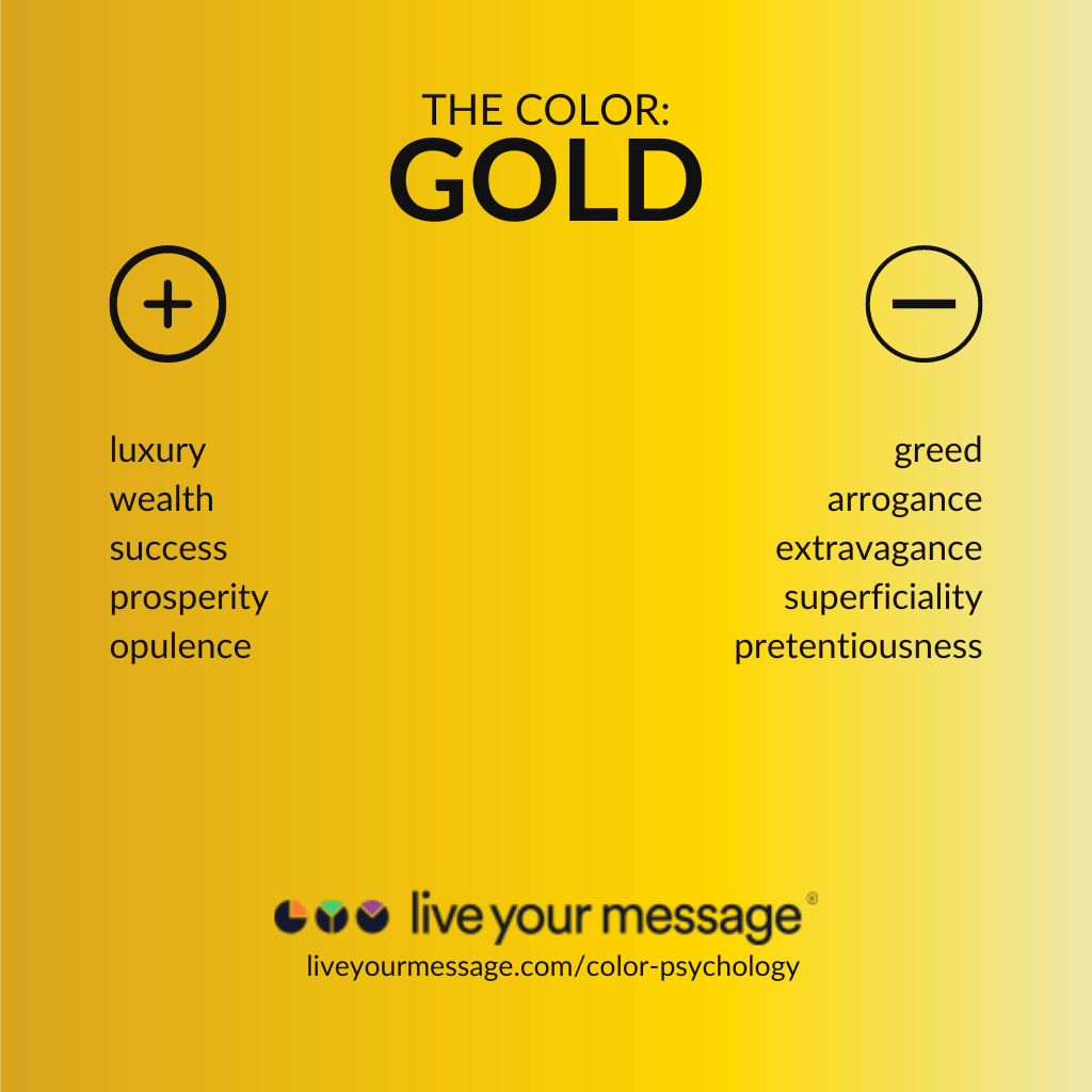
Negative feelings associated with the color gold include greed, arrogance and extravagance. The color gold can also be associated with superficiality and pretentiousness.
The Color Gold in Branding
When used in branding, gold can give a feeling of prosperity and opulence. That’s why gold is the color of choice for high-end brands like Dolce & Gabbana, Versace and Porsche.
You Should Use Gold If…
…you want to create a brand that feels prosperous and sophisticated.
5. Green
Though both men and women prefer “cool” colors like green and blue, women have a stronger preference.
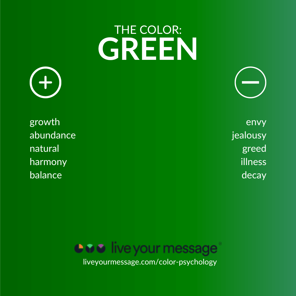
Negative feelings associated with the color green include envy, jealousy and greed. The color green can also be associated with illness and decay.
The Color Green in Branding
When used in branding, green can give a feeling of refreshment and peace. That’s why green is prominently used by brands such as Whole Foods and Tropicana.
You Should Use Green If…
…you want to create a brand that feels fresh and peaceful.
6. Orange
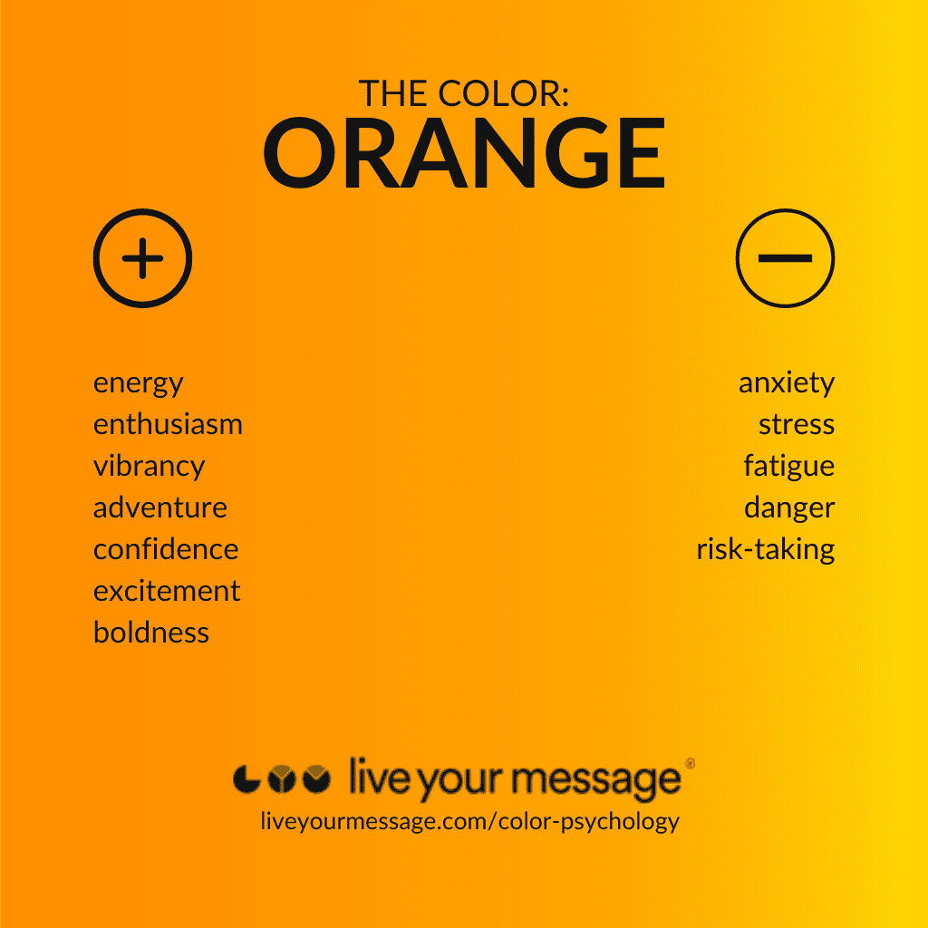
Negative feelings associated with the color orange include anxiety, stress and fatigue. The color orange can also be associated with danger and risk-taking.
The Color Orange in Branding
When used in branding, orange can give a feeling of excitement and boldness. It’s little wonder then why brands like Harley-Davidson and Nickelodeon use orange so prominently.
You Should Use Orange If…
…you want to create a brand that feels exciting and bold.
7. Pink
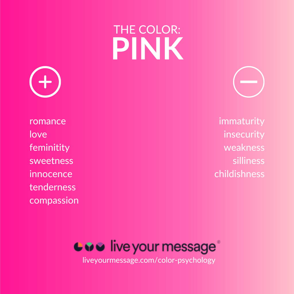
Negative feelings associated with the color pink include immaturity, insecurity and weakness. The color pink can also be associated with silliness and childishness.
The Color Pink in Branding
When used in branding, pink can give a feeling of femininity. That makes pink a popular color for brands like Barbie, Victoria’s Secret and Cosmo.
You Should Use Pink If…
…you want to create a brand that projects tenderness and compassion.
8. Purple
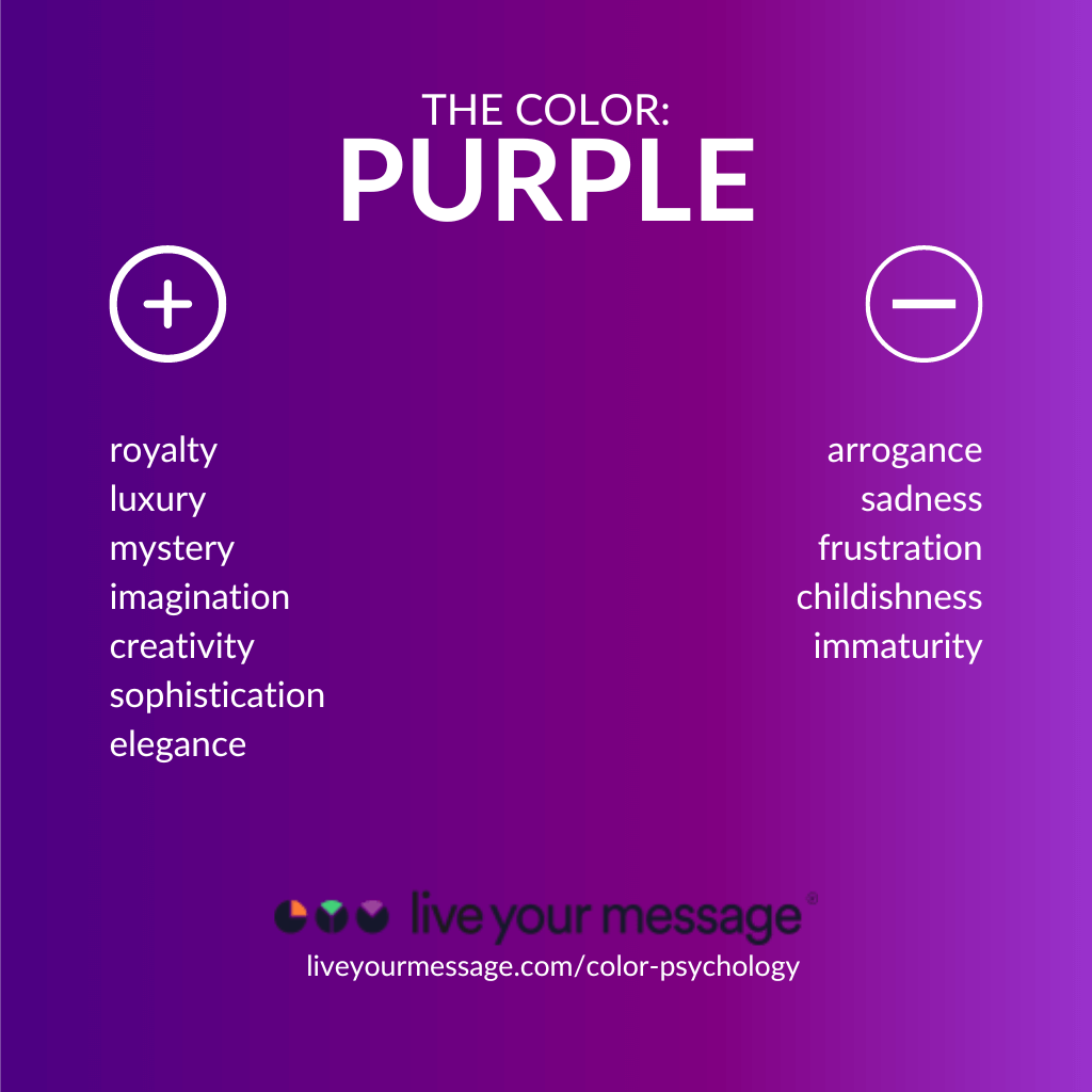
Negative feelings associated with the color purple include arrogance, sadness and frustration. The color purple can also be associated with childishness and immaturity.
The Color Purple in Branding
When used in branding, purple can give a feeling of sophistication and elegance. That makes it a popular choice for brands like Asprey of London, Cadbury and Scentsy.
You Should Use Purple If…
…you want to create a brand that feels lavish and extravagant.
9. Red
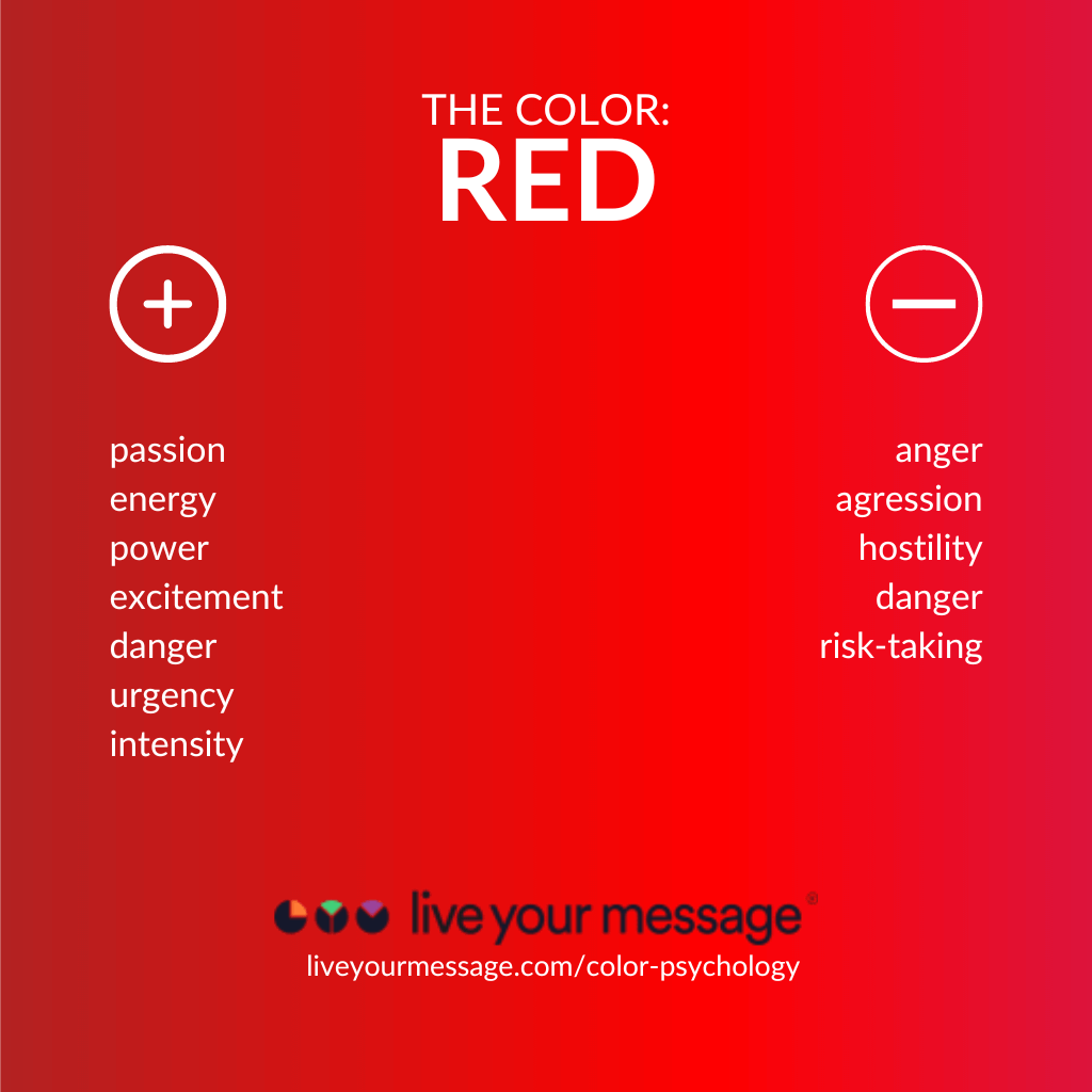
Negative feelings associated with the color red include anger, aggression and hostility. The color red can also be associated with danger and risk-taking.
The Color Red in Branding
When used in branding, red can give a feeling of energy and intensity. That makes it a popular color choice for companies like YouTube, Wendy’s and Coca-Cola.
You Should Use Red If…
…you want to create a brand that feels exciting and powerful.
10. White
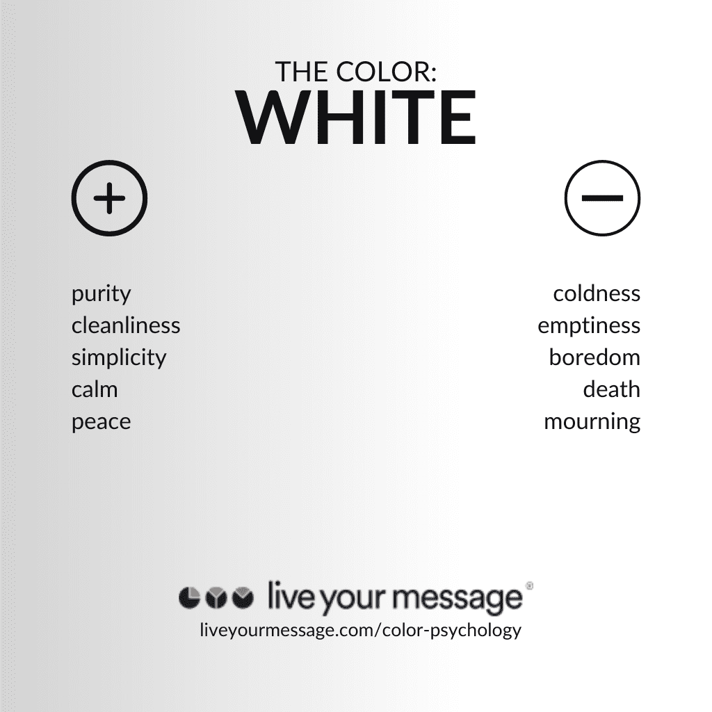
Negative feelings associated with the color white include coldness, emptiness and boredom. Though white symbolizes purity in countries like the United States, in Japan and India white can also be associated with death and mourning.
The Color White in Branding
When used in branding, white can give a feeling of serenity and peace. That’s why companies like Nike, Mini and Burberry use white (often pairing it with black) in their logos.
You Should Use White If…
…you want to create a brand that feels tranquil and serene.
11. Yellow
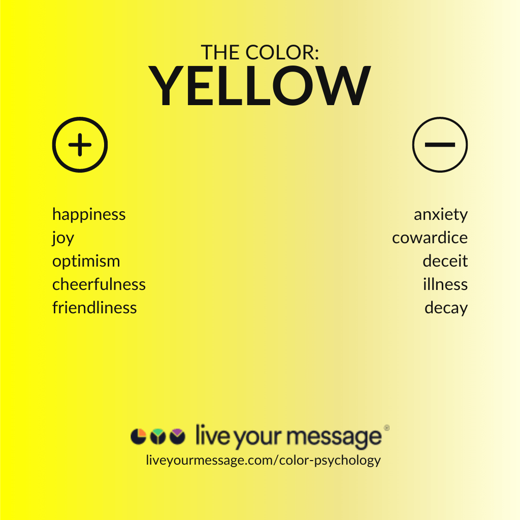
Negative feelings associated with the color yellow include anxiety, cowardice, and deceit. The color yellow can also be associated with illness and decay.
The Color Yellow in Branding
When used in branding, yellow can give a feeling of cheerfulness and friendliness. No wonder it’s the color of choice for family-friendly brands like McDonald’s, Cheerios and Nesquik.
You Should Use Yellow If…
…you want to create a brand that communicates happiness and optimism.
How Will You Use Color Psychology in Your Business?
By understanding how color psychology works, businesses can create branding strategies and design products that appeal to their target market.
Smart businesses have known this for a long, long time. And now so do you!
So, what are your thoughts on color psychology? Is it something you’ll incorporate into your own branding strategy?
Let me know in the comments below!
And one more thing…
Now that you understand the power of color in your brand, you want to make sure your website is impressing your customers and getting you sales. Sign up for my FREE masterclass on the 3 Tweaks to Turn Your Website into a Lean, Mean, Money Making Machine and learn how to keep 18-50% of first-time visitors on your website longer!
Love it? Hate it? Let me know...
-
My course topic is all about love so of course I’m going to choose red thanks for the color psychology Marissa!
-
Love this, Tricia!
-







Leave a Comment